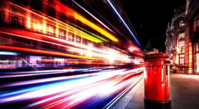

Printing Westminster, London SW1

Posted: January 22, 2018 • Posted in: Graphic Design, Printing London
Announced last month, Pantone’s colour of the year for 2018 is Ultra Violet. Described as an ‘inventive and imaginative shade of purple’, PANTONE 18-3838 is ‘complex and contemplative’ and will be seen everywhere in 2018.
According to Pantone’s press release which announced the 2018 colour choice, ultra violet is a ‘dramatically provocative and thoughtful shade’ which ‘communicates originality, ingenuity and visionary thinking that points us towards the future’.
With a nod back to the individuality of musical icons Prince, David Bowie and Jimi Hendrix, the use of Ultra Violet suggests experimentation and non-conformity, a trait we expect to see reproduced throughout design in 2018.
Conversely, the use of purple in meditation offers a release from today’s over stimulated world. Representing a period of calm in an era of smartphones, social media and virtual reality that is much needed in today’s ever increasingly digital world.

Seen as a colour snapshot of the events and ideologies taking place in the world, Pantone’s colour of the year sets trends in all elements of design. Providing inspiration to the fashion, interiors and graphic design sectors, you can expect to see PANTONE 18-3838 in a lot of projects this year.
Especially important in marketing and branding – colour can evoke emotions and elicit responses in its target audience, shaping their decisions and ensuring their effectiveness. Knowing what colours are in vogue, and the reasonings behind this can influence when they are used for maximum impact.
Pantone have been choosing a colour of the year since 2000. This colour is chosen by the Pantone Colour Institute, a team of representatives from various nations’ colour standards groups. Meeting in secret twice a year, these representatives debate for a couple of days, before agreeing on a colour that represents the zeitgeist of the forthcoming year.
Influenced by trends in the global fashion, film and car industries, the committee look at macro influences in these sectors to determine their colour choice. Other influences include the psychological messages emitted by the chosen colours, studies into their meanings and the styles of famous personalities.

2017: Greenery PANTONE 15-0343
2016: Rose Quartz PANTONE 13-1520 & Serenity PANTONE 15-3919
2015: Marsala PANTONE 18-1438
2014: Radiant Orchid PANTONE 18-3224
For companies wanting to catch the eye in 2018, the team at Kall Kwik St James’s can help. Our design specialists can help create materials that attract attention and inspire action. We know what’s on trend, and can advise you on the best colours to use in your artwork. To find out how Kall Kwik can help you in 2018, call us on (020) 7930 1976 or get in contact through our online form.