
Printing Westminster, London SW1

Posted: February 13, 2019 • Posted in: Graphic Design, Printing London
At the start of last year, we looked at the graphic design trends we thought would be big in 2018. As with everything in life, graphic design is constantly evolving. Styles that were seemingly out of favour have been given a facelift and are now back in the mainstream.
So, having predicted big things for hand drawing, bright colours and creative typography last year, this year we’re looking at metallic effects, big typography and asymmetric layouts.
Last year we showed how illustrations could add an edgy look to original photography. This year, adding colourful flat backgrounds can have a similar effect.
Likewise, illustration is seen more and more in digital media as well as print. Tablets and touchscreen laptops have meant digital illustrations are becoming easier to create and are seen in increasingly creative ways.
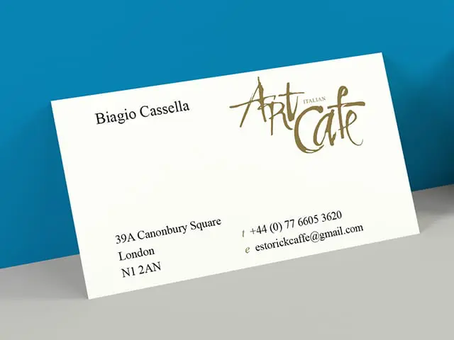
Whenever it is used, gold gives the impression of luxury. Of exclusiveness. When seen on product packaging you assume the item inside will be expensive, opulent and lavish. When seen on invitations the recipient knows the event will be high class.
With a nod to the art deco designs of the 1920s and 1930s, foiling will also become more widely used in typography.
As well as incorporating foiling effects, 2019 is the year when typography goes even bigger. When using a big font as the main element of your design, the key consideration is simplicity. Make it readable, make it stand out, but don’t detract from other design elements on the page.
Combine capital letters with lower case to create an impressive and intriguing design.
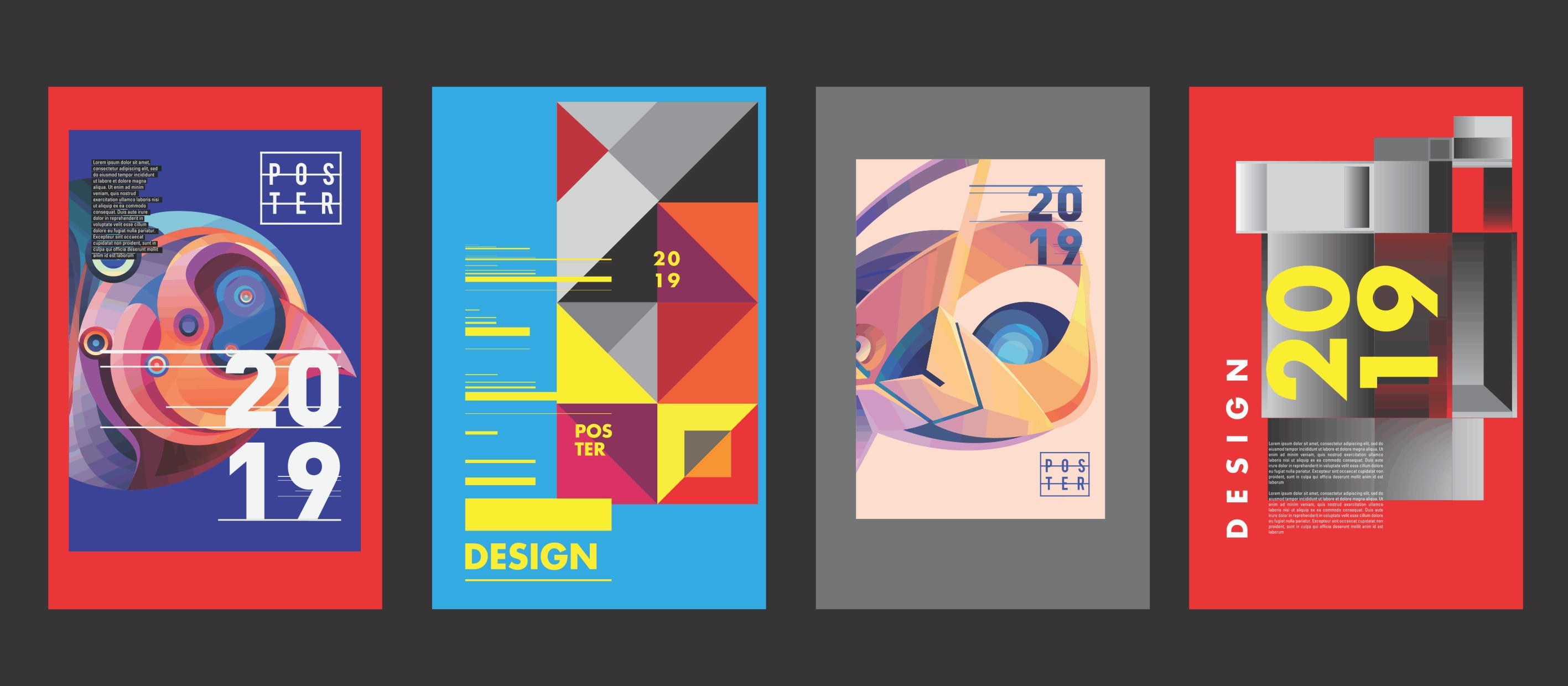
While designers have often tried to keep text and other design elements separate, the current trend is to make them overlap, incorporating them into the design itself.
Asymmetrical designs are used to create edgy looking designs. In website design, off-grid layouts are used to make a statement and stand out in an environment where rigid grids are the norm.
Another example of rebelling against conventions, asymmetric designs go against the symmetry we’re used to in the natural world, helping them to stand out, setting brands apart from the competition.
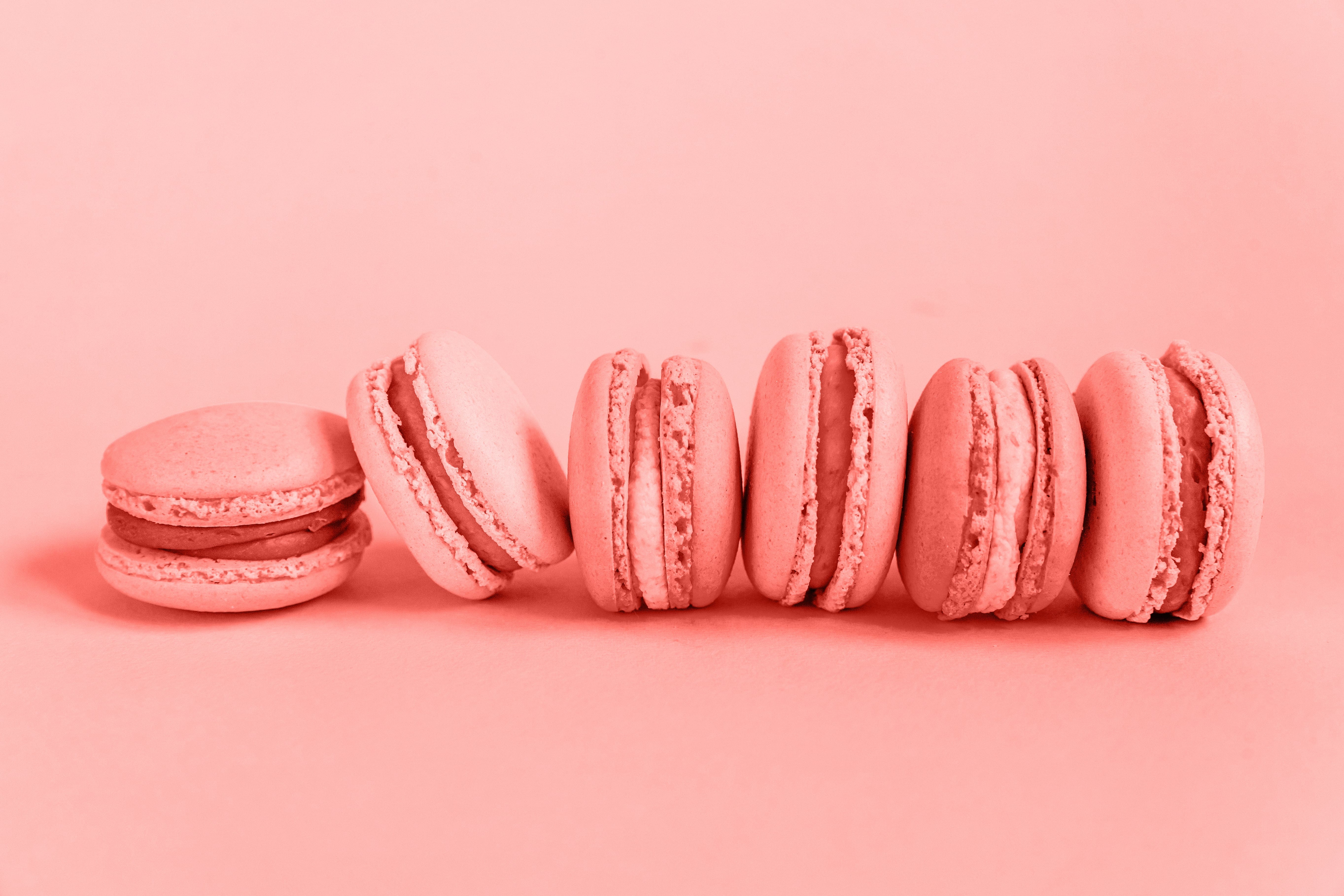
Back in December, Pantone announced their colour of the year as PANTONE 16-1546 Living Coral. Chosen because of the ‘warmth and comfort it provides in a continually shifting world’, Living Coral has also been spotted on catwalks and on social media. Expect to see this used in designs throughout 2019.
We have a team of graphic designers and artworkers to turn your concepts into great looking printed material. To find out more, please contact our design team on (020) 7930 1976 or email [email protected].


